
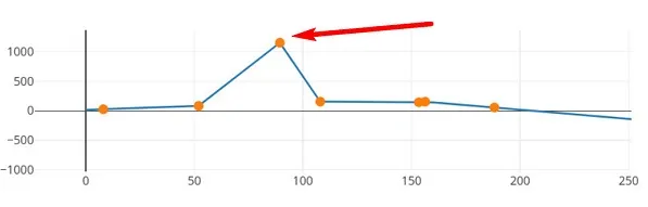
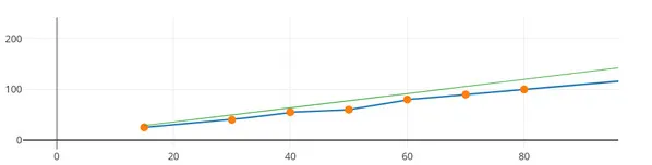
1. Check the prices visually on the chart
- Collect data about prices on routes by clicking on the button "Get prices from routes & check then”

- Reload the page
- Look at the chart
If you have high curve peaks on the chart, it means that your prices are inflated and you will receive fewer orders that you could.
What to do with it?
Find the route for the appropriate kilometer and correct the price. Collect data about prices again and reload the page
If you see a decrease (fall) in the curve, it means that you have lowered prices. Find routes with low prices on the corresponding kilometer and correct the prices.
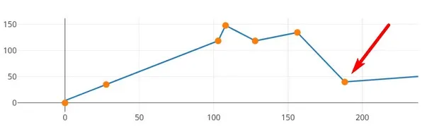
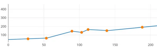
The correct price chart has a smoothly increasing type
2. Check the relevance of your prices compared to competitors
You can see a green curve on the chart that indicates the average competitors ' price in the same vehicles class.
If the green curve is located under your price curve, it means that your prices for this class of vehicle are inflated. Customers will book more from your competitors. You will receive a less number of orders orders that you could.
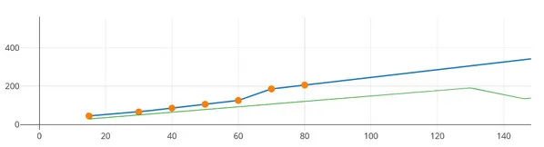
We recommend that you adjust your prices so that your prices are slightly lower than those of your competitors.
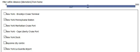
3. Set prices for all routes in a minute
After editing the prices on the chart, select the transport hubs that you serve from the list and for which to create routes and / or set prices.
Click " Create missing routes for selected transport hubs and set prices”
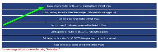
You can set prices for each transport hub: select the transport hub, edit the price chart, and set prices. Reload the page and repeat for another transport hub.